Designing our new catalogue
User experience led design
One of the main challenges in designing a new catalogue for the Library was how to combine different published and archival collections in a consistent way. The Library’s catalogue contains unique and complex data from many sources — much of it many decades old — which isn’t always compatible with contemporary digital systems.
Our approach in UX or user experience design is to understand and prioritise what users (or ‘readers’, as we call them at the Library) want.
The main considerations in UX design are:
- Reader driven — build a product with the readers in mind and with their ongoing input
- Intuitive product — guide readers through the product and collection data coherently and logically
- Hero the content and encourage exploration — highlight the incredible wealth of resources in the Library’s collections and give readers the opportunity to discover more
- Easily accessible — make sure readers can quickly find what’s relevant to them
- Clear language — use direct and clear language and explain specific Library terminology when needed.
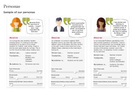
Early on, we put together a set of ‘user personas’ to help the team build a product with our readers in mind. These personas represent different key groups and we use them to keep in mind our readers’ motivations, challenges and points of satisfaction when using the catalogue.
Agile
Using the Agile methodology, (a form of project management designed to deliver products and services that prioritise user needs), we are building the catalogue incrementally and releasing it in stages, with readers involved all the way along.
This has many benefits for the Library and, most importantly, for readers. Rather than waiting until the finished catalogue is launched, readers can use the site’s features much more quickly. We can then actively engage with our readers to get their feedback, which helps inform priorities for future releases.
Benefits of an agile approach:
- Collaborative — teams work closely together rather than in silos
- Incremental product releases — readers can start using new features faster and don’t have to wait as long to see improvements
- Quick feedback — engage actual readers throughout the process and gather feedback that will inform the next product iterations and design hypothesis
- Easier to refine — releasing in small increments allows the team to work faster and adapt to unknowns.
Design and research process cycle
So far, we’ve engaged over 160 readers in our research exercises — as well as receiving daily comments via our feedback function on the site. UX research activities have included card sorting exercises, reader interviews, and user testing sessions. We’ve even managed to do some ‘guerrilla’ testing by approaching visitors in the Library cafe and reading rooms for quick feedback.
A typical feature cycle will involve:
- Problem definition — we conduct internal and external interviews, look at analytics and usability on existing platforms, industry analysis and run workshops to identify reader requirements.
- Design and iteration — creating lots of wireframes, designs and problem-solving workshops which are then shared through regular feedback sessions with Library staff, usually leading to lively debate!
- Prototypes and build implementation — prototypes (basic mock-ups of designs) are used to conduct user testing so that we can quickly validate ideas and minimise risks when it comes to the build. Once thoroughly tested, our design solutions are built by our back-end and front-end development teams and are tested again before being launched to the public.
- UX research — usability testing, feedback, analysis and insights from the latest release will feed into future iterations and help form future design hypotheses.
An example of this flexible and iterative process can be seen in the creation of our new Digital Collections homepage. We shortlisted two alternative designs and created prototypes which we used to seek feedback from staff and test with readers and visitors. As well as identifying the preferred design, we gained valuable insights into how the page would be used and gathered feedback on content and design that informed the final build.

UI design and design system
User Interface (UI) design relates to what users see when using a website. Smart and successful UI design should visually guide the user intuitively throughout their interactions. For our new catalogue, it was important to ensure that the visual design referenced the State Library’s brand guidelines, and was visually appealing but did not distract readers from the Library’s rich collection content. Applying some of the same design rules and structures through every feature and area of the site helps us present a consistent and clear product.
A shared, component driven design system made it easier to visually align and maintain a consistent experience across our new catalogue and Digital Collections sites.
So far, our design system includes:
- Responsive grids — consistent layouts across multiple sizes
- Iconography — a custom created SVG library
- Typography — set type styles used across the sites
- Colour palette — referencing the colours used in other SLNSW designs
- Design rules — on spacing, colour use and typography
- Component library — from buttons to larger components such as the image viewer.
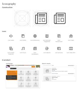
A component led approach allows for more flexibility and speed in reusing and updating components across the site. It also means we would be able could reuse components across our other State Library sites and platforms, presenting a consistent experience for our readers.
Next steps
As a designer it can sometimes be a struggle to launch parts of the site incrementally as we may not have all the features and designs 'perfect' yet. However, using an agile and collaborative approach enables us to adapt to the real needs of our readers. Our design cycle allows for constant changes and improvements to be released, which ultimately makes our final designs more useful, meaningful and relevant to readers. We’re excited to have new features to share with you soon, including a custom-built audio player and access to subscription-based articles available through the new catalogue.
Please continue to check our new catalogue for more updates — we’d love to hear your feedback as we continue to release new features and enhancements based on your experiences, insights and ideas.
Jenny Lam
Senior UX/UI Designer