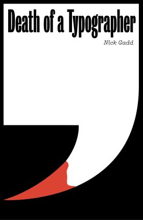
Melbourne author Nick Gadd couldn’t have penned a happier design story for his murderous thriller if he’d tried. His novel Death of a Typographer came out of many years of conversations with his friend Stephen Banham, font nerd and graphic designer. So when it came to preparing the novel for publication, Banham was a natural choice as its designer — a suggestion that Gadd’s publisher, Australian Scholarly Publishing, embraced. The striking result, featuring a quotation mark that resembles a bloodied weapon, was co-winner of the Designers’ Choice Cover of the Year at the 2020 Australian Book Design Awards. Inside the book, Banham also displayed his design chops, using a different font for each chapter title.
‘Originality is not always valued in cover design,’ says Gadd. ‘A lot of mainstream publishers don’t want covers that look different — they want covers that look like last year’s bestseller. If The Dry was a big hit last year, they want a cover that looks like The Dry. I’m with a small, independent publisher where authors have more chance of being heard.’
New authors are often surprised to learn they have little, if any, say about their book’s cover. Writers can also be reluctant to push back on designconcepts, not wanting to affect the relationship with their publisher. They also know that other forces — such as sales and marketing expertise — are at work. Speaking up can become easier, though, with more publishing experience.
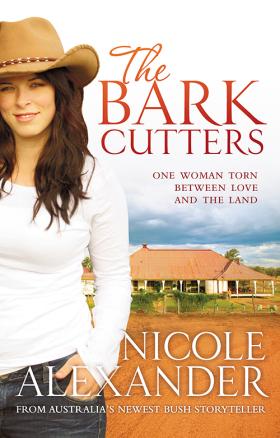
Moree author Nicole Alexander has written 10 historical fiction novels, starting with The Bark Cutters in 2010. ‘The first time I sat down with Random House and they showed me the cover for that book, I was like, “Oh, I wasn’t expecting that”,’ recalls Alexander, who is also the judging panel chair for adult novels in this year’s ARA Historical Novel Prize, Australia’s richest genre-based literary award.
‘It had a girl on the front with a cowboy hat on and a homestead in the background. I realised they’d bought straight into the popularity of McLeod’s Daughters [a TV series that ended in 2009]. That was a really good example of how what’s happening culturally or in the entertainment world can affect what’s happening in other creative industries.’
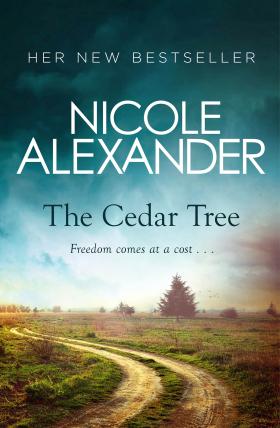
The covers of her two most recent books, Stone Country and The Cedar Tree, feature landscapes. This design evolution, Alexander says, more accurately reflects that her books are about Australia’s pastoral history rather than rural romance.
When Alexander was first published, she was ‘just happy to be there and agreed with the experts’. These days, because her books involve so much painstaking research, her current publisher, Penguin Random House, ‘always comes back to me to say, “What do you think?”’ She tweaked the colours for Stone Country’s cover to better suit its Northern Territory setting and pointed out that The Cedar Tree’s initial design featured a tree that wasn’t a cedar.
They say you shouldn’t judge a book by its cover. Yet as Jay Lansdown, owner of the Constant Reader Bookshop (with two locations on Sydney’s Lower North Shore), says: ‘Everybody is actually judging a book by its cover. As a bookseller, it’s really important for us to be able to get as much of our stock face-out so people are looking at covers rather than the spine. The reason you want to do that is because books sell on their covers — without a doubt.’
One book doing just that, says Lansdown, is The Boy, The Mole, The Fox and The Horse — a whimsical advice book that came about after English artist Charlie Mackesy posted a moving illustration on Instagram. ‘That’s one of those books we have on the counter,’ Lansdown says of the surprise international bestseller.
A book might also feature different covers as it changes formats or countries. One cover change that puzzled Lansdown, for instance, was for Charlotte Wood’s 2015 novel, The Natural Way of Things, published by Allen & Unwin. ‘The original design with the wattle was incredible and everyone loves it,’ he says. ‘Then it came out in the smaller format with a lady with a shaved head [and endorsements down each side] and it was like, ‘What did you do that for?’”
HarperCollins ANZ creative director Mark Campbell can help answer that. ‘You go for the biggest market possible the first time it goes out,’ he says. ‘You might do a very literary cover and, if the book does well there and you think it has a chance to do better in a chain store, you sometimes bring it out in a second format and you change the cover. That’s because they’re trying to get different readers for each edition of the book.’
After all, the window for grabbing a reader’s attention is tiny, says Campbell, who runs the HarperCollins Design Studio, which assigns work to both inhouse and freelance book designers. ‘You’ve got three to five seconds to grab people so you want them to understand what kind of story they’re going to get. But, as I always say, “Don’t give them too much”. There are some genres [such as romance and crime] where the books all look the same and then some like literary fiction where you want to look really different. Literary fiction always ties itself closely to whatever the current graphic design trend is. They can be as avant-garde as you want them to be.’
A new challenge that’s come along for book designers is the ‘cover reveal’ trend on Instagram. Because the book cover is a rectangle within a square viewed on a phone, says Australian Book Designers Association (ABDA) president Hannah Janzen, ‘the standard book cover is now also judged on how it’s viewed as a postage stamp-sized tile’. Books are often also seen for the first time as a tiny cover in online stores such as Amazon, she says.
‘This means we have an even smaller amount of time as a designer to grab the viewer’s attention,’ says Janzen. ‘Often this is done through a lens of bright colours and bold typefaces, which help a book pop at a minute size.’ When traditional book launches and author speaking events were cancelled during last year’s lockdown, she says, new books were almost solely viewed as tiny images on websites. ‘I had a number of cover briefs change during lockdown due to things like the chosen Pantone colour or embellishment was difficult to clearly convey digitally and something else was chosen to better suit the online market.’
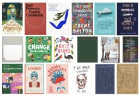
Certainly, bright colours reigned at this year’s ABDA Book Design Awards, where Darren Holt’s intricate design for Trent Dalton’s All Our Shimmering Skies was named both Best Designed Commercial Fiction Cover and Designers’ Choice Cover of the Year (cover detail shown in story banner). ‘Of course there are colour trends,’ says Campbell. ‘The publisher of [Dalton’s] Boy Swallows Universe, Catherine Milne, who is our head of fiction at HarperCollins, has published a lot of books in the last year or so that are pink and orange and purple. I say to her, ‘Oh, we’re getting into your colour palette now!’ She’s drawn to it.
Rick Morton’s My Year of Living Vulnerably is pink and orange, and Nikki Gemmell’s The Ripping Tree is pink and red and purple. We were trying to work out why she’s drawn to those colours. It’s a lovely, warm, happy colour palette and maybe after the last year of everything that’s happened around the world, it’s just a pleasing colour palette to look at and it makes you feel happy.’
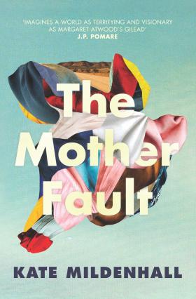
Janzen also wonders if the pandemic inspired ‘a trend of surrealism as a reaction’ to the times we find ourselves in. ‘We’ve seen many covers with deconstructed shapes, jarring angles and cubism playing with the ideas of space and reality, such as The Mother Fault designed by Sandy Cull,’ she says.
‘We have also seen a trend of titles with interruptions, where beautiful typographic titles are interrupted, obscured or hiding part of the title to create suspense such as [Mark Mordue’s Nick Cave biography] Boy on Fire, designed by Hazel Lam, and Lindy Lee, designed by Claire Orrell. There’s also an increase of rough sketches and handwritten text, pixel art, blurry images or text, collage-style (specifically a lot of bodies without heads or heads without bodies) and a good dose of millennial pink.’
Campbell took out an ABDA design award in 2020 with his cover for Felicity McLean’s The Van Apfel Girls Are Gone, which included tendrils of hair draped over the embossed title letters. ‘I painted those hairs in [on the computer],’ he says. ‘I sampled three different colours because blonde is a difficult hair colour and it looked really realistic. There’s a mystery in that book and it’s slightly creepy so having the hair over the letters like that made it feel a little more uneasy.’
Ultimately, Janzen says, ‘we want the book to have a conversation with you and call to you from the shelf … The goal is to get you to pick up the book.’ Campbell puts it this way: ‘I love what a book cover does between readers and authors and designers — it’s like a whole kind of secret society. I just think that’s really special.’
Katrina Lobley is a Sydney-based freelance writer.
This story appears in Openbook Spring 2021.
Related Stories


New chapters
On diversity, discomfort and the turning of a new page for the Australian publishing industry.


Novel thinking
Jamie Marina Lau began her second novel in a dream-like state that belies her intense research.