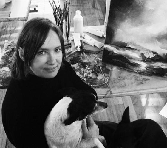
Artist Kerrie Leishman has always been attracted to mysterious, atmospheric and ambiguous imagery. Her poetic and layered artworks found a public outlet in newspapers — just as the world of news media was on the lookout for original ideas, in what turned out to be a golden era. Fortuitously, too, she sought out the State Library as the custodian of her artful drawings. Recently, I’ve had the pleasure of exploring this rich archive of evocative illustrations. My first encounter with Leishman’s work confirms and magnifies its impact — the intensity and detail of her graphite drawings is mesmerising; with the added depth of jewel-like colour they seem to glow from within.

Through a combination of good luck and timing, Leishman landed her dream job, working in the art department of John Fairfax Ltd in 1986. She produced illustrations for the Sydney Morning Herald and other Fairfax publications for the next 30 years, working remotely for over a decade from Kangaroo Valley, where she continues her artistic practice today.
Growing up in rural Victoria, she’d always been encouraged to draw, but like many young creatives, she pursued her artistic ambitions against family advice. A Commonwealth Scholarship enabled her to attend art school in her hometown of Ballarat in the mid-1970s, which she followed up with the obligatory cultural pilgrimage to Europe. In London, Leishman secured her first exhibition, using leftover house paints and cardboard to create artworks inhabited by the same stylised figures who would later stride through her newspaper illustrations.
Leonard offered Leishman a job and for the next few years she became part of the Sweet Art team. Learning to paint on icing and sculpt cakes into outlandish shapes, she witnessed the highpressure process of transforming a client’s brief into preliminary drawings and finished art. One day in 1986, illustrator Jock Alexander came into the shop to order a cake. This chance encounter gave Kerrie the break she’d been waiting for: he suggested she head over to the Fairfax offices in Ultimo to meet the company’s new art director, John Sandeman, who was in the process of revamping the paper.
The newspaper industry entered a period of rapid change in the 1980s. Newspapers had been using an evergrowing number of photographs and illustrations since the 1940s, but production and design were about to be transformed. As a high-school student, I went on an excursion to the Fairfax plant at Broadway. These were the days of ‘hot metal type’ and our tour took in all aspects of the production of The Sun, Fairfax’s afternoon newspaper. Ushered through the smoke-filled newsroom, buzzing with journalists clattering away on their typewriters, and into the gloom of the photographic darkroom, we headed down to the grimy, noisy composing room. After witnessing the deafening shudder of the printing presses rolling, our tour ended in the docks where the freshly bundled papers sat waiting for dispatch. As a souvenir of our visit, we each received a sample of hot type — warm to the touch and spelling out our names. I have mine still.
The Sydney Morning Herald celebrated its 150th anniversary in 1981 but the era of hot metal was about to end. On 27 March 1984, the morning edition of the masthead was produced using ‘cold type’ for the first time – nothing short of a technological revolution. As John Sandeman tells it, the Herald was, ‘nearly paperless from the time the journalists type their stories on visual display terminals (similar in appearance to personal computers) … until it hits the street’.
In 1985 Sandeman was put in charge of modernising the look of the paper. Sydney’s premier daily broadsheet (fondly known as Granny) was looking old-fashioned. Sandeman was tasked with updating it to attract a younger readership. This saw the inclusion of new daily sections like ‘Good Living’, ‘Metro’ and ‘The Guide’, magazine-style inserts with large artworks on the covers, and fresh typography, layout and design.
Sandeman’s first job was to ‘blow the cobwebs off the art department.’ Keen to ‘nurture talent’, he says he was intent on ‘building diversity into this new brigade of world-class artists.’ Kerrie Leishman was among them. ‘Most of the people whose names you know as cartoonists or illustrators today came through the Fairfax art department at that stage’, says Sandeman. As well as Leishman, Sandeman’s stable of stars included Jock Alexander, Jenny Coopes, Andrew Ireland, Bill Leak, John Shakespeare and Amanda Upton.
Leishman recalls she was, ‘thrown in the deep end, and just started drawing.’ Illustrating on demand is an intense process. Leishman drew herself into the job with pencil and paper, finding her own language of self-expression and creating a unique style. Despite the constant pressure to work fast, she remembers the department’s eclecticism and inclusiveness, which encouraged collegiality and originality. Often, she was the only female illustrator in the large light-filled workroom, set up with three long rows of drawing tables. At other times she and Amanda Upton sat side-by-side on tall stools, each focused on their drawing assignments.
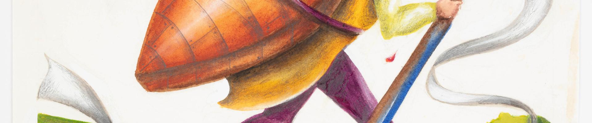
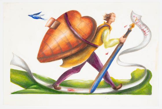
She speaks passionately about her process, fondly describing the simple tools of her trade — the seemingly endless supplies of ‘really good quality’ German drawing paper on hand in the Fairfax workroom — thick, smooth and hard, ideal for precise graphic work. There were the ‘clutch pens’ she became addicted to. Most of her drawings were done with a Staedtler micro pencil, fitted with her preferred 0.5 mm and 0.7 mm graphite leads, either 2B or 4B. ‘I just loved those pencils’, she tells me. ‘I became addicted to using only these and it definitely helped develop my drawing technique. I went through a lot of them! Sometimes, if I needed to fill in a large dark area fast, I used a thicker type of mechanical pencil fitted with a chunkier 5.6 mm lead, but mostly it was the Staedtlers. I also used watercolour or gouache for the colour covers of the features sections and for the Northern Herald.’
On any given day Leishman might produce two or three illustrations, from sketch to finished artwork, in just a few hours, each with its printers instructions: ‘Drop the dot, Ta’, or ‘Return to artist’. But by far the toughest job was the illustration for the next day’s Opinion page.
The topic was often not decided until after midday and the deadline was 4 pm. In this short timeframe, whoever got the job had to read the brief and come up with an idea that had to be approved by the editor and worked up into finished art. The biggest hurdle was waiting to be told the size available for the illustration. This depended on the final layout of the page, which, in turn, was governed by the amount of advertising sold. Leishman recalls her frustration when her original idea for an illustration was compromised to fit into the layout or, worse still, scrapped all together. Then, another idea had to be mapped out, approved and executed, always working against the clock.
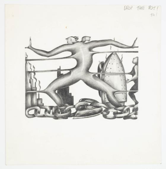
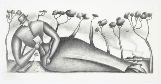
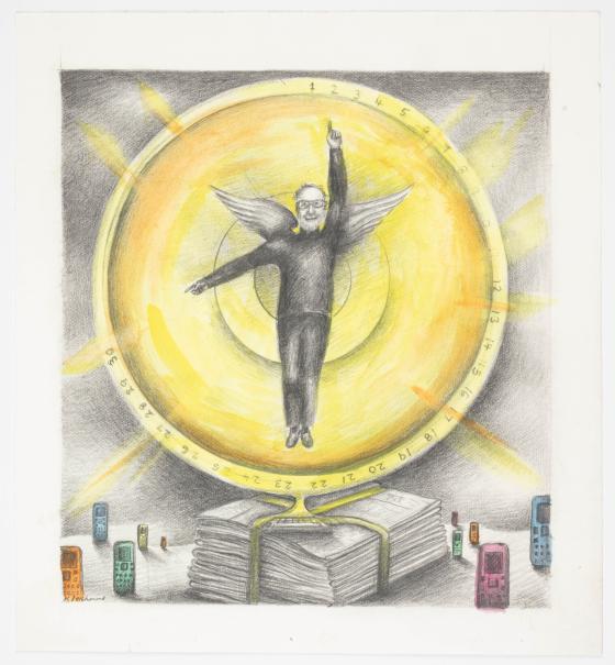
Leishman’s graphics were deliberately intended to catch the eye of the page-turning browser and offer a cryptic teaser — distilling the essence of the story and hooking the reader into reading more. Suggestive, without giving too much away. Always on deadline, Leishman strove to capture the relationship between the written and visual. Working with leading journalists and social commentators — Ross Gittins, Hugh Mackay, Tim Flannery, Robert Manne and Anne Summers — she crafted clever pictorial representations of their news articles and opinion pieces. Leishman tells me that while working as an editorial illustrator was exciting and stressful she loved seeing her drawings printed in the paper — mainly in black and white but later, increasingly, with the added boost of colour.
Sandeman had ensured that the artists retained copyright in their work as a potential secondary-income source. Thus, Leishman could approach the State Library in December 1999, offering archived examples of her Fairfax work, many signed and bearing printer’s instructions, and accompanied by a copy of the newspaper article for which the illustration was created. The Library had showcased its interest in the genre that year with its exhibition, ‘Australians in black & white: (the most public art)’, which displayed works by several Fairfax alumni.
On this initial acquisition of Leishman’s illustration, then Curator of Pictures, Elizabeth Ellis, described her as, ‘one of a young generation of women artists who has achieved national recognition in the still largely male-dominated industry of black and white newspaper artists.’ The Library has since built a collection of Leishman’s work from 1987 to 2012, over 100 examples in varying media that document the arc of her career.
Burnt out, Leishman took redundancy from Fairfax in 2016 to focus on her painting and teaching. Late last year, she published a curated collection of her artworks — many from the Library’s collection — accompanied by selected quotes from many of the columnists with whom she collaborated.
These days, pencil illustration has largely disappeared from newspapers, but Leishman still believes that a drawing crafted with just pencil and paper can have a big impact. Created before the world was engulfed by digital imagery, her conceptual artworks still offer new ways of seeing. Intelligence and character shine through her artful drawings, expressing her perceptions of the human experience, reaching out and connecting to the viewer. Her work, now and then, inspires us to think more deeply about social issues and events as they are reported in the media.
Margot Riley, curator.
This story appears in Openbook summer 2021.
Related Stories


Daring and devotion
The art of Sydney couple George and Charis Schwarz defies neat categories, but their body of work will be preserved.

When newspapers took over Australian television
The machinations behind the first Australian television licences.

Gifts from the sea
The timeless appeal of shells has seen them preserved in many ways over the centuries.